
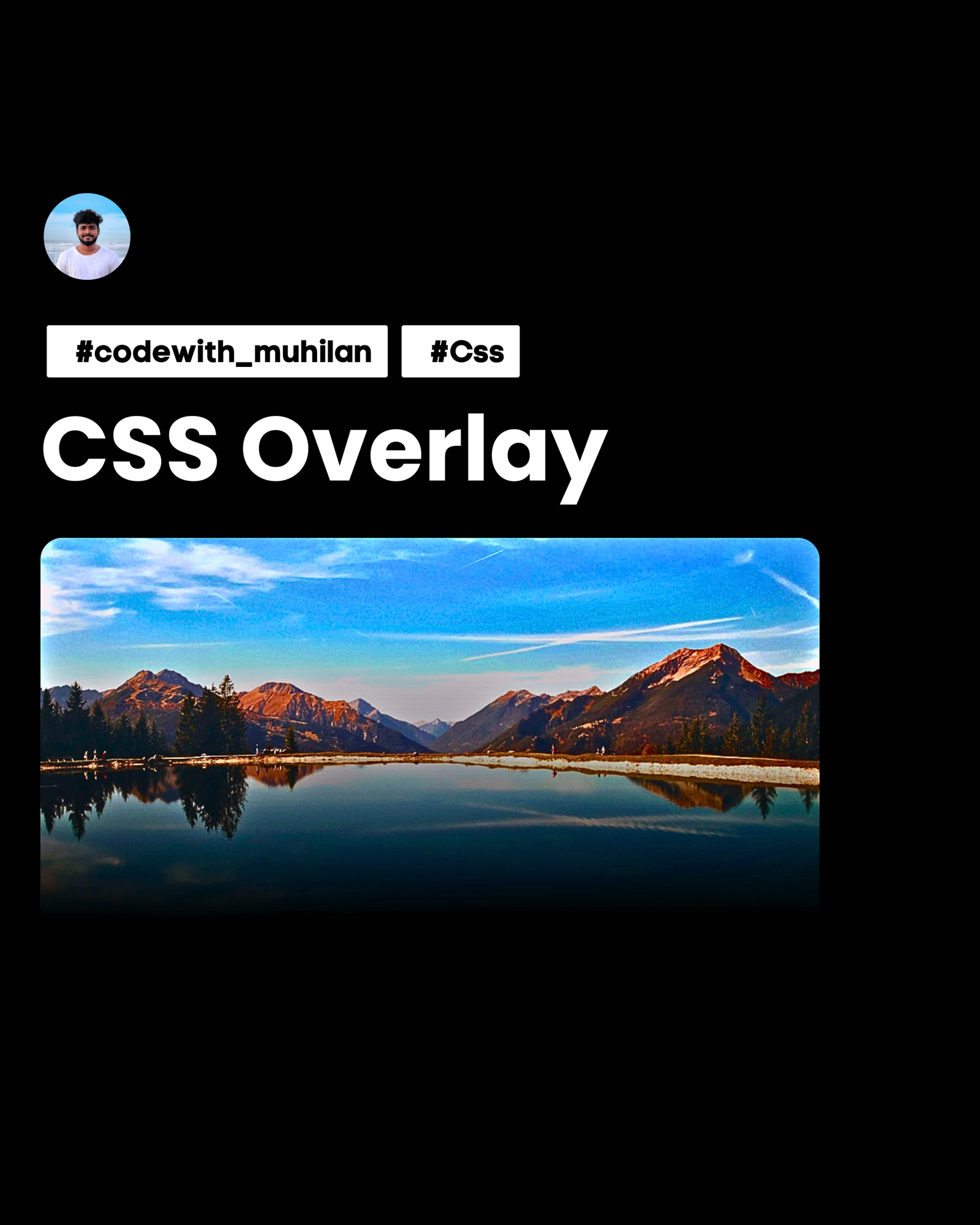
CSS Overlay Variables and Techniques for Images
Key Highlights Covered in the Document: The Modern border-image: fill 0 Trick (As shown in your post snippet): Explains how border-image: fill 0 linear-gradient(...) enables direct gradient overlays on single <img> tags without needing extra container <div> elements or ::after pseudo-elements. Explains the syntax breakdown (fill, 0 slice offset, color alpha channel values like #0003 to #000). CSS Overlay Variables Integration: How to construct reusable master utility classes using CSS Custom Properties (--overlay-top, --overlay-bottom, --overlay-angle). How to override variables dynamically in inline HTML or component classes. Detailed Practical Examples: Text Contrast Overlay: Top-to-bottom dark gradient for high readability over images. Interactive Hover Effects: Fading / changing overlays on user interaction. Instagram/Brand Style Tints: Multi-stop gradient overlays (e.g. blue to dark slate, sunset gradients). Radial Vignette Overlays: Darkening outer edges for portrait focus. Technique Comparison Matrix: Comprehensive table comparing border-image: fill 0, ::after pseudo-elements, background-image stacks, and mix-blend-mode. Accessibility & Cheat Sheet: Contrast guidelines (WCAG 2.1 AA) and quick snippet cheat sheet for fast reference.
Authentication required before file download.
Key Features & Overview
This ui kits asset package comes fully pre-configured and optimized for direct integration into your next-gen web applications and design workflows.